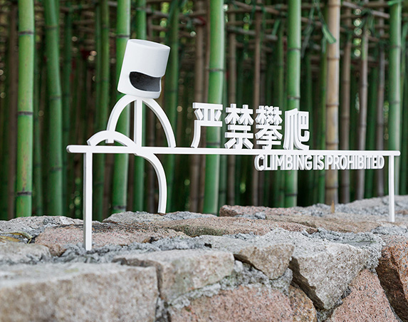
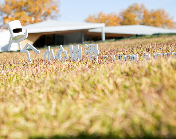

Notice Sign
Size: 220mm × 850mm
Materials: 304 Stainless Steel / 201 Stainless Steel / Galvanized Steel Sheet
Price: // ***
Design Philosophy
This set of signage adopts “Natural Integration · Minimalist Warning” as its core design concept, aiming to break away from the rigidness of traditional safety signs. It allows functional warnings to coexist harmoniously with the surrounding natural environment and architectural style. Through low-interference visual language, it clearly conveys safety information while becoming an organic part of the landscape, enhancing the overall aesthetic quality of the environment.
Visual System Design
- Icon Language
- Utilizes abstract, minimalist human figure designs. Exaggerated yet clear postures (climbing, descending stairs, slipping) intuitively convey warning meanings. This enables quick understanding without excessive text, lowering cognitive barriers and making it suitable for all age groups.
- Color Scheme
- Pure white is chosen as the primary color, creating a gentle visual contrast against natural backgrounds like stone walls, grassy areas, and rock piles. This ensures the signs are eye-catching and identifiable without disrupting the overall environmental tone, achieving the effect of “blending into the environment, yet standing out within it.”
- Layout Logic
- Employs a combined layout of “Icon + Bilingual Text (Chinese & English).” Icons are positioned before text, establishing clear visual hierarchy. Chinese text uses simple sans-serif fonts, paired with stylistically consistent English fonts. The overall layout is neat and aligned, ensuring efficient information delivery with a modern feel.
Materials and Craftsmanship
- The signs are crafted using metal three-dimensional cutting techniques, with smoothly polished edges for a refined texture.
- The materials offer excellent outdoor weather resistance, enduring sunlight, rain, and other natural elements without easily deforming or fading over time, balancing aesthetics with durability.
- The three-dimensional design also ensures optimal visual effects from various lighting angles.
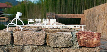
No Climbing: Installed beside low stone walls or rock piles. The icon’s climbing action directly corresponds to the prohibited behavior, providing precise and highly context-relevant warnings.
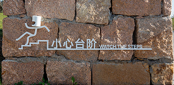
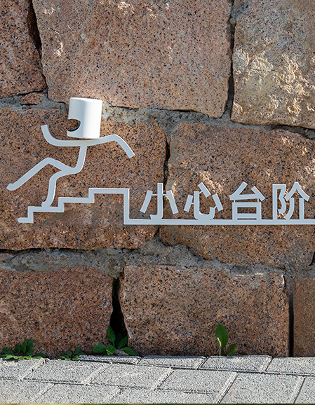
Watch Your Step: Placed adjacent to stone steps or walls. The figure’s descending motion perfectly matches the step scenario, strengthening the warning’s relevance.
Slippery Surface: Positioned in grassy or sloped areas. The figure’s slipping posture visually correlates with the “slippery” risk, enhancing the persuasiveness of the warning within the context.
Style Consistency
- All three signs employ a completely unified design language (icon style, typography, materials, colors), creating a highly coordinated series.
- This not only ensures the functionality of individual signs but also gives the overall space a more complete and professional visual experience.