

Art-Zavod Platforma (Kyiv Platform Art Factory) Wayfinding and Signage System
Wayfinding and Signage System Design Description
I. Design Philosophy
Centered on the “visual translation of industrial DNA,” the wayfinding system inherits the industrial language of the factory’s original “grids, frames, and metal.” Through high-contrast colors and modular structures, it builds clear visual guidance while preserving the historical texture, transforming the signage into a bridge connecting the old industrial space with contemporary creative scenes.
II. Core Design Features
Modular Metal Frame System
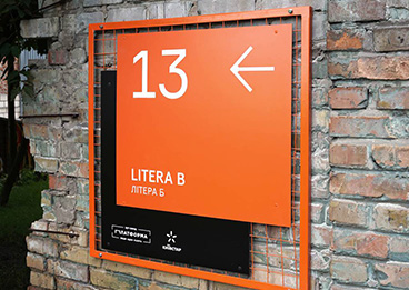
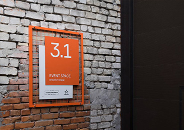
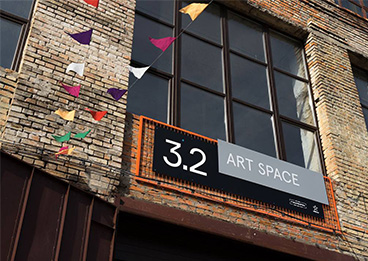
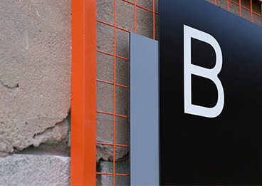
A unified orange-painted metal grid frame serves as the visual carrier, with all signage units embedded within it, forming a strong visual identity.
The grid structure echoes the original steel framework of the factory, while the orange, an industrial safety color, creates a striking visual anchor against the backdrop of weathered brick walls and concrete, significantly enhancing signage visibility.
High-Contrast Color Logic
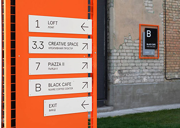
The color palette employs “orange + black + white + gray”: the orange frame acts as the unifying visual element, while black, white, and gray serve as the base colors for information display. Color contrast is used to differentiate information hierarchies (e.g., orange blocks indicate functional areas, white blocks display numbers and text).
This color logic aligns with the robust aesthetic of the industrial space while ensuring clear readability of information in the complex environment.
Clear Information Hierarchy
Signage is divided into three levels:
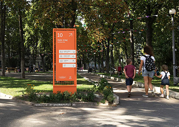
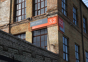
Primary Signage (Outdoor Landmarks): Large grid frames paired with high-visibility numbering (e.g., “3.1,” “5”) serve as visual landmarks for spatial nodes.
Secondary Signage (Functional Guidance): Hanging or wall-mounted grid plates use arrows and colored blocks to indicate directions and functions (e.g., “WC,” “FOOD COURT”).
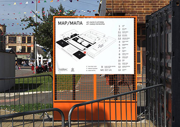
Tertiary Signage (Floor Maps): Combines isometric diagrams and numbered lists to clearly present the layout of the complex, enabling visitors to quickly orient themselves.
Material and Craftsmanship Locality
The primary materials are weather-resistant metal plates and grid frames, treated with fluorocarbon coating to withstand Ukraine’s climate conditions. Text and graphics are applied using screen printing and UV curing processes, ensuring long-term clarity and durability.
The detachable frame design allows signage content to be flexibly updated as the complex evolves, meeting the dynamic operational needs of the creative park.
III. Functional Value
Spatial Activation: The orange frames of the wayfinding system create a visual contrast with the industrial backdrop, revitalizing the old factory space and reinforcing the brand positioning of “industrial heritage + contemporary creativity.”
Experience Optimization: Clear information hierarchy and high-visibility colors help visitors quickly locate target areas within the complex factory environment, enhancing accessibility and the overall experience.
Brand Cohesion: The modular visual language runs consistently throughout the complex, creating a distinctive brand memory and strengthening Art-Zavod Platforma’s visual identity and communication appeal.


