

Forum Mall (India) Wayfinding and Signage System
Project Positioning: A wayfinding system for a high‑end shopping mall chain in India, designed to serve multilingual and multicultural consumers.
Design Core: Centered on “dynamic geometry + high‑visibility visual symbols,” the system combines functionality and contemporary artistry to create a commercial wayfinding experience.
Wayfinding and Signage System Design Description
I. Design Philosophy
Focused on “flowing visual guidance,” the system breaks away from the rigid forms of traditional commercial signage. Through dynamic geometric patterns and high‑contrast colors, it transforms navigation into a visual journey, meeting the directional needs of a complex shopping environment while reinforcing Forum Mall’s premium brand identity with a modern aesthetic.
II. Core Design Features
Dynamic Geometric Visual Symbols
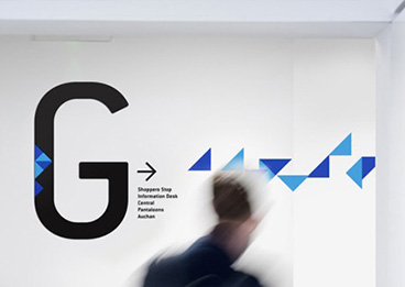
Using a combination of blue gradient triangles as the core visual motif, the design simulates the motion of “flowing arrows.” This creates a continuous visual flow across walls and signage panels, naturally guiding shoppers toward target areas as they move through the mall.
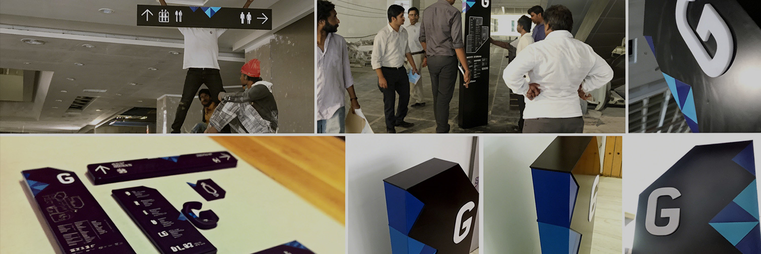
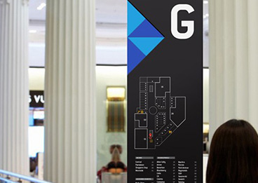
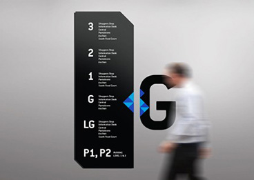
The main floor identifier “G” (Ground Floor) incorporates the blue triangle element, strengthening floor recognition while echoing the overall geometric language.
High‑Contrast Colors and Clear Hierarchy
A minimalist color scheme of “black + white + blue” is employed: black serves as the base for signage panels, white text and icons ensure clear readability, and blue triangles act as visual accents and dynamic guides, forming strong visual anchors in the bright commercial environment.
Clear Information Hierarchy:
Floor Landmarks: Freestanding signs feature oversized letters (G/1/2/3) along with floor plans for quick orientation to functional zones.
Functional Guidance: Hanging or wall‑mounted signs use arrows and icons to distinguish facilities such as restrooms and escalators.
Wall‑Mounted Navigation: The letter “G” paired with flowing triangle graphics creates a continuous visual path, enhancing the sense of spatial exploration.
Multilingual and Inclusive Design
Signage is bilingual, with English + local language (Hindi), to accommodate India’s multicultural context. Universal symbols are used for icons like restrooms, ensuring quick comprehension by shoppers of diverse language backgrounds.
Signage height and font sizes are ergonomically optimized for both adults and children.
Modularity and Contextual Adaptation
A flexible combination of “freestanding + hanging + wall‑mounted” formats is used:
Atrium Areas: Freestanding signs act as visual landmarks, complemented by floor plans and tenant directories.
Corridors: Hanging signs and wall graphics work together to form a continuous guidance flow.
Functional Zones: Compact wall‑mounted signs mark restrooms, elevators, and other facilities, maintaining the consistent visual language.

III. Materials and Craftsmanship
Primary Materials: Outdoor/atrium signage uses weather‑resistant aluminum panels with matte powder coating, while indoor signs employ acrylic with UV printing for durability and color stability in commercial settings.
Craftsmanship Details: Text and graphics are produced with laser engraving and UV curing. The blue triangle elements are printed with gradients to achieve dynamic visual effects. Edges of signage panels are bevel‑cut to enhance the modern geometric aesthetic.
Ⅳ. Functional Value
Enhanced Experience: Dynamic geometric elements turn wayfinding from a purely functional tool into a visual feature of the mall, enriching shoppers’ exploration and overall visit.
Improved Efficiency: High‑contrast colors and continuous visual guidance significantly reduce the likelihood of shoppers getting lost in the complex layout, boosting the mall’s operational efficiency.
Brand Reinforcement: The contemporary visual language aligns seamlessly with Forum Mall’s premium positioning, creating a distinctive brand impression and strengthening its commercial appeal.


