

Pier 70, San Francisco: Wayfinding and Signage System Design Description
Project Background: Building 12 at San Francisco’s Pier 70 was once the site of Union Iron Works and Bethlehem Steel Company, a core historical structure of the city’s shipbuilding industry that carries the weighty memory of industrial heritage. This wayfinding system is designed to provide clear visual guidance for the repurposed complex—now housing manufacturing, retail, and light industrial office spaces—while preserving the industrial historical context, achieving symbiosis between old and new architecture.
I. Design Philosophy
Centered on the “contemporary translation of industrial heritage,” the modular and scalable wayfinding system echoes the building’s original steel structure and shipbuilding techniques. The signage is designed to become part of the spatial historical narrative rather than a standalone functional element.


II. Core Design Features
Modular System
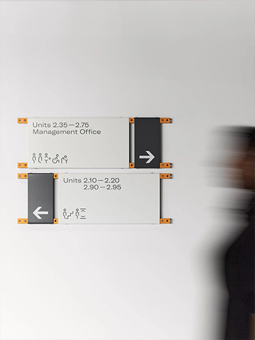
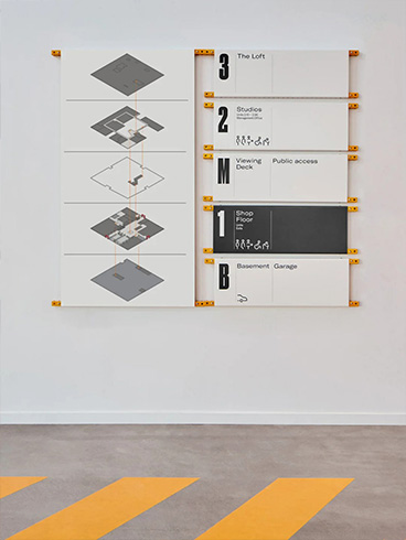
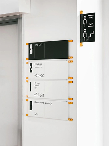
A standardized combination of “rails + rivets + steel plates” is used. All signage units are made from laser-cut and stamped steel plates, secured to perforated rails with rivet nuts.
This design allows for flexible adjustments in size and arrangement according to spatial needs without damaging the original building structure, making it perfectly suited for the adaptive reuse of the historic site.
Continuation of Industrial Aesthetics
Steel plates are chosen as the primary material, with a matte surface finish that complements the exposed steel beams and wooden flooring of the building.
Orange fasteners and perforated rail details replicate the connection methods used in shipbuilding, reinforcing the industrial character of the space.
Innovative Visual Language
Icon System: Geometric, minimalist human-shaped symbols form the core, extended into icons for stairs, restrooms, accessible facilities, and more, ensuring stylistic consistency and high recognizability.
Color Logic: A primary palette of black, white, and gray is accented with orange, balancing clear readability with high-contrast visual emphasis.
Hierarchy: Information priority is distinguished through size and color intensity (e.g., floor numbers use oversized black backgrounds with white text, while functional guidance employs contrasting black-and-white layouts).
Accessibility and Inclusivity
Signage includes Braille, and key locations such as restrooms feature icons representing diverse users, including wheelchair users and children, reflecting thoughtful consideration for all visitors.
The height and placement of signs are ergonomically designed to ensure readability for both wheelchair users and children.


III. Materials and Craftsmanship
Primary Material: Laser-cut cold-rolled steel plates with a matte powder-coated finish, offering durability and refined texture.
Mounting System: Anodized aluminum rails with stainless steel rivet nuts, providing rust resistance and easy disassembly for adjustments.
Craftsmanship Details: Text and icons are created through etching and paint-filling processes, ensuring long-term clarity and wear resistance.
Ⅳ. Functional Value
Spatial Storytelling: Beyond functional guidance, the system translates industrial elements into a narrative that allows users to engage with the building’s history as they move through the space.
Adaptability: The modular design allows for flexible updates in response to future tenant changes and functional adjustments, reducing long-term maintenance costs.
Enhanced Experience: The clear, minimalist visual language integrates seamlessly with the industrial ambiance, elevating the complex’s brand identity and overall visitor experience.


