

Tate Modern, London – Blavatnik Building (Switch House)
Project Background
To design a signage and wayfinding system for the new wing of Tate Modern, a contemporary art space converted from a former power station, adapting to its dual identity of industrial heritage + avant‑garde art.
Design Statement for the Wayfinding & Signage System
I. Design Concept
Centered on “Contemporary Dialogue of Industrial Heritage”, the wayfinding system inherits the building’s raw minimalist DNA. Through an unadorned visual language deeply integrated with the concrete and steel textures of the architecture, it fulfills navigation needs in the complex museum space while acting as an invisible narrator, reinforcing Tate Modern’s dual identity as industrial heritage and avant‑garde art destination.


II. Core Design Features
1. Authentic Architectural Visual Language
Signage is directly printed or engraved onto architectural structures: oversized floor numbers (e.g., “2,” “3”) are spray‑painted in matte finish on concrete walls; donor plaques are inset as black metal panels into walls. Wayfinding information merges seamlessly with the building, preserving the original character of the industrial heritage.
This disappearing design keeps visitors’ focus on art and architecture rather than intrusive signage.
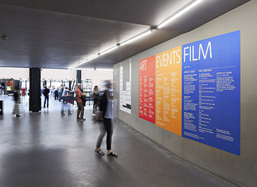
2. Modular Information Hierarchy
Lobby maps use a modular black‑white‑gray layout to clearly distinguish the Boiler House (original building) and Switch House (new wing), with minimal text labeling floor functions for instant clarity.
Event zones use high‑saturation colors (red, orange, blue, green) to differentiate sections such as ART, EVENTS, and FILM, creating visual focal points within the industrial interior and supporting the museum’s dynamic exhibition program.
3. Dynamic Adaptability
The system supports fast updates for temporary content: wall posters use replaceable vinyl or acrylic panels; temporary exhibition signs can be applied directly to concrete columns, accommodating frequent exhibition rotations.
A combination of universal icons + English text ensures usability for international visitors while maintaining visual minimalism.
4. Contextual Materials & Craftsmanship
Core materials match the building’s palette: wall signage uses screen printing or laser engraving directly on concrete or steel; information panels employ matte anodized aluminum, consistent with the industrial aesthetic.
Durable craftsmanship: text and graphics use UV‑cured printing or laser engraving for long‑term clarity under high foot traffic with minimal maintenance.


III. Functional Values
Spatial Narrative Enhancement: The disappearing design 延续 the industrial heritage narrative, letting visitors experience architectural history while engaging with art.
Improved Navigation Efficiency: Modular infographics and oversized floor numbers allow quick orientation to galleries, restaurants, shops, and other facilities.
Consistent Brand Identity: The raw, minimalist visual language aligns with Tate Modern’s positioning of avant‑garde art + industrial heritage, strengthening spatial recognition and memorability.
Sustainable Design: Integration with building structures reduces excess material use; modular updating lowers long‑term operational costs and supports environmental goals.


